January 14, 2022 · 5 min read
A Brief Guide to Color Psychology for Startups
Color psychology looks at the properties of colors and the emotional associations we create with them. This is useful in business for designing your brand.
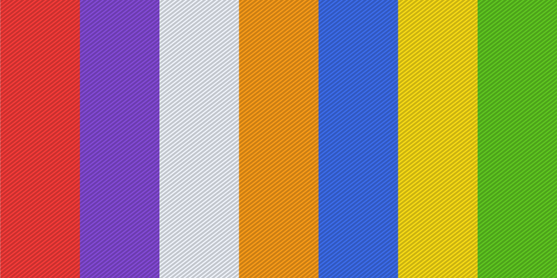
Color psychology looks at the properties of colors and the emotional associations people commonly attach to them. In marketing and branding, it's often cited as a factor in how people perceive a brand and decide whether to buy from it. Worth saying up front: color-emotion research is a young field, much of it built on small studies that haven't been widely retested, so treat the color associations below as common patterns rather than settled science.
If you're a startup, understanding these general patterns can still help you narrow down a color that fits your brand personality — just don't expect any single color choice to make or break the brand on its own.
Impact of Color in Branding
Color is one of the first things people notice about a logo, and it shapes their early impressions of a brand: does it feel cool, interesting, or worth a second look? With color playing that outsized a role in first impressions, it's no surprise marketers spend real time choosing the right one for a brand or campaign.
So what is the right color for your brand? If you're launching a startup, which color would (or should) you choose to convey your brand's personality and message to your audience?
Pick One Color
You have three goals when picking a color for your brand:
- It must resonate with your audience
- Sets you apart from the competition
- Fits your brand personality
On a sheet of paper, write down all the colors in a color wheel, then start the elimination process. Right off the bat, exclude the colors that you don’t like. You shouldn’t feel anything negative when you look at your brand, right?
Next, consider your target audience. Colors that attract children would be vastly different from those that attract wealthy middle-aged men. So while a bright yellow, red, or pink would be great for a toy brand, the same may not look completely appropriate on a male-centric country club branding.
Then, research your competition. Avoid using color combinations that are too similar to a competing brand. Also, stay away from colors that are too dominant in your industry. Instead, pick their variations and establish your unique identity.
Lastly, the color you select must fit your brand naturally. The feeling that you want to evoke in your audience when they see your brand logo should manifest in your color choice.
Now, Pick a Variant
Now that you have finalized a color, it’s time to choose its correct variant. It can be a shade (black added to the color) or a tint (white added to it). Darker shades appear bolder, more serious, and sophisticated. Lighter and brighter colors are more inviting and cheerful.
This variant will act as your primary color. You can choose another couple of colors (or shades or tints) to create a brand color palette. These secondary colors can act as accent colors to elevate your brand message even further.
Brand Personality vs. the Color
To choose the most fitting color for your brand, these are commonly cited associations to browse through. Look at these and figure out what vibe you're aiming for, then choose a color people generally find appropriate for it — treating these as starting points for your own judgment, not fixed rules.
1. Red
Red is commonly associated with intensity and passion in Western marketing contexts, though that association is more folklore than settled research. In branding, it tends to read as bold, exciting, and attention-grabbing — a reasonable fit if that's the presence your brand is going for.
2. Purple
Purple is often described as evocative of intuition, mystery, or luxury. It's a popular choice for brands built around creativity, imagination, or premium positioning, and shows up frequently in wellness and spiritual-adjacent branding as well.
3. Grey
Grey doesn't carry much emotional charge of its own, which is part of its appeal — it reads as neutral and lets other design elements or the brand's message do the talking. It's a common choice for brands leaning on technical precision, minimalism, or objectivity.
4. Orange
Orange tends to read as approachable and energetic without the intensity of red or the brightness of yellow. It's a frequent pick for startups that want to feel welcoming and a little less buttoned-up than their competitors.
5. Blue
Blue is consistently one of the most broadly liked colors across surveys of different cultures and demographics, which likely explains why it's such a common default for brands aiming to signal trust and stability. The tradeoff: a "safe" color choice can also mean a less distinctive one, so weigh that against how much you want your brand to stand out.
6. Yellow
Yellow isn't a color for conservative statements. It reads as bright, warm, and hard to miss — a common choice for startups in travel, leisure, sports, and transportation looking for a confident, upbeat presence.

7. Green
Green is strongly linked to nature and growth, which makes it a natural fit for environmental, wellness, or sustainability-focused brands. It's also associated with money in US culture (an association that doesn't hold everywhere), which is part of why it shows up often in finance and banking branding as well.
Conclusion
Color psychology is a field of research that is still developing, and much of what gets repeated as fact in marketing content is more "commonly believed" than rigorously proven. Rather than pinning your brand's success to one "correct" color, use these patterns as a starting point, then test how your actual audience responds to the color choices you're considering.